How relevant is Pantone’s Colour of the Year to your business?
We’ll share the advantages and disadvantages of following Pantone’s colour forecast.

How relevant is Pantone’s Colour of the Year to your business?
The launch of the Pantone Colour of the Year lives in design fans’ minds just as much as an upcoming tech launch or legendary band’s ticket sales. Whether it influences design and branding materials is not to be questioned. Yet, there can be long-term disadvantages when adopting the latest hue as a business owner.
Therefore, this article will highlight several arguments for and against making changes based on Pantone’s Colour of the Year. After reading, you will discern whether adopting this shade is right for your brand.
What is Pantone Colour of the Year?
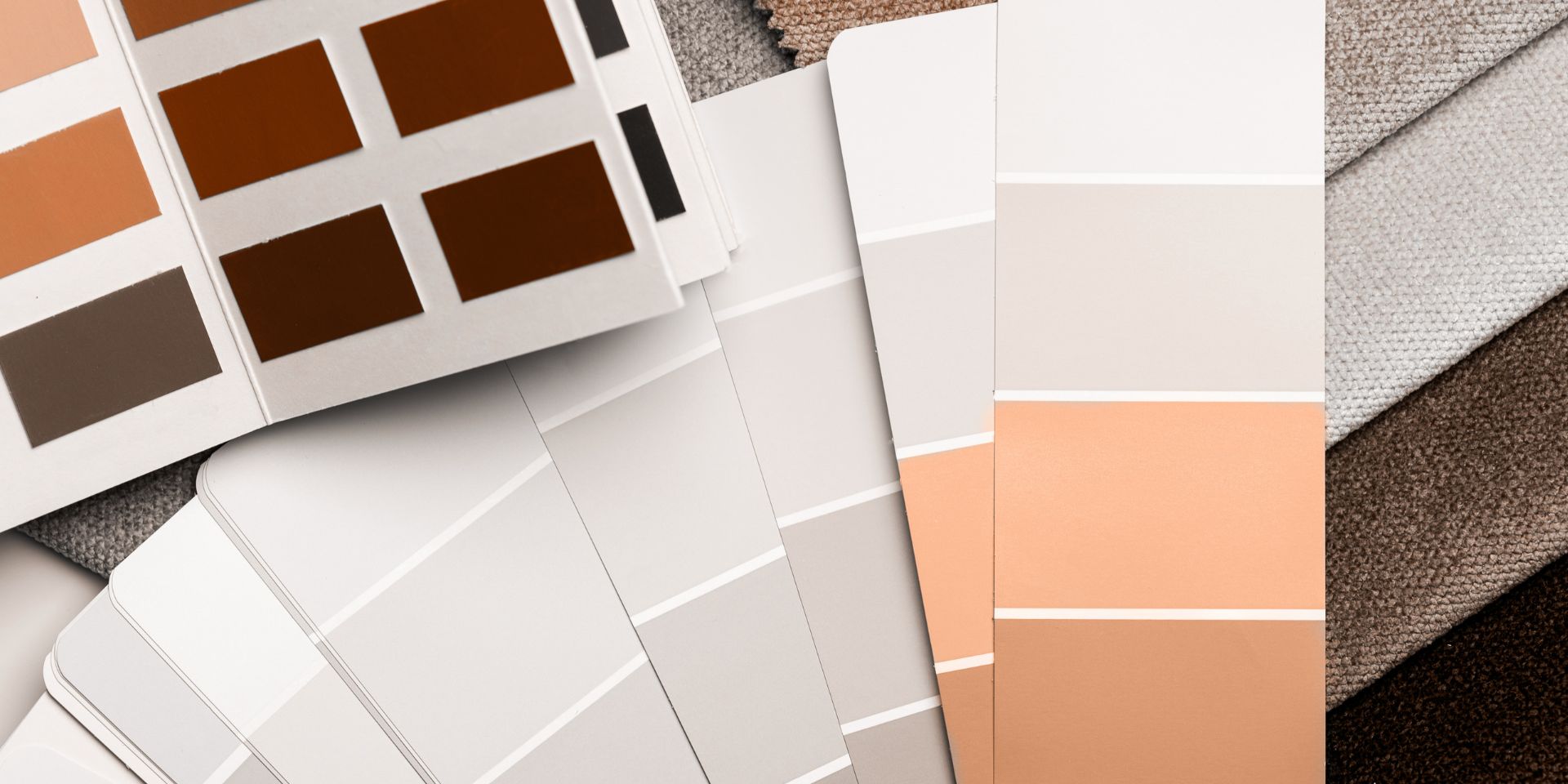
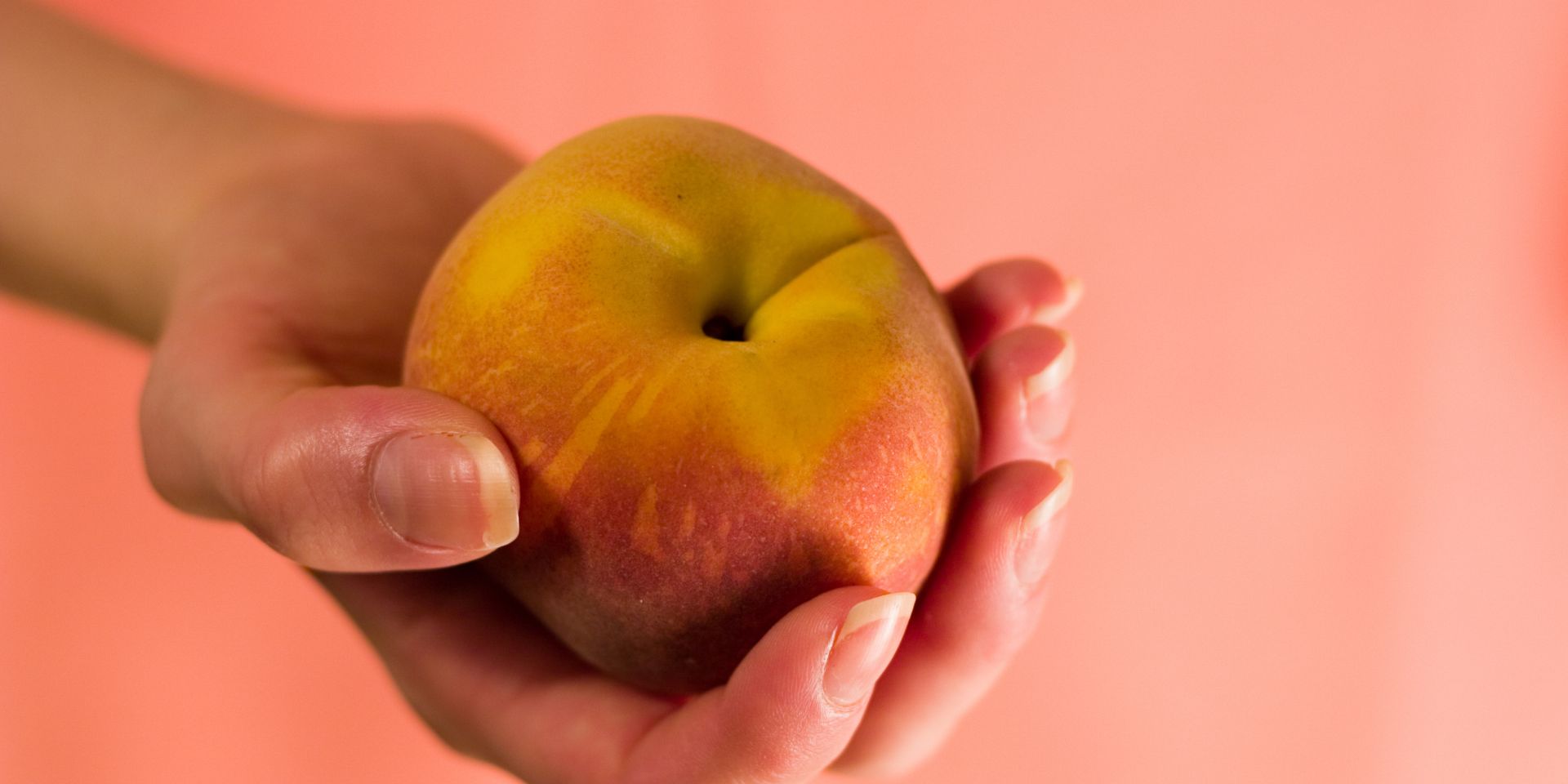
Dating back to 1999, experts at the Pantone Colour Institute have made an annual announcement regarding the colour(s) they view as capturing the moment. This year’s hue is Peach Fuzz or ‘13-1023 Peach Fuzz’ and appears on the official Pantone website.
Colour forecasters base their selection on popular culture references. According to Pantone, these references can range from fashion shows, films, art, entertainment and trending travel destinations to the social, political and economic climate. Innovative materials and effects, as well as sports and social media, can also inform their decision.

The global reach of Pantone’s Colour of the Year
But it is more than a mere observation. This colour or colours, as more than one hue was chosen in previous years, sets the tone for countless “branding, marketing, fashion and product design” spheres, as Arch Daily writes.
Capturing visual language for 25 years, the Pantone Colour of the Year also provides a message reflective of the general mood of the day. A Design Week article covering 2024’s choice reveals that “Peach Fuzz was chosen by the team for its ability to convey a desire to be close to loved ones, as well as the simple joys of “a moment of quiet time alone”, according to Pantone. Peach Fuzz carries “a message of compassion and empathy”.
The advantages of adopting Pantone’s Colour of the Year

You can showcase your awareness of design
The first benefit of utilising the Pantone Colour of the Year is highlighting that you follow modern design. Often adopted worldwide across the industries noted above, many of your customers or clients will be aware of this shade several months into the new year.
Trends within the design and web design industry change over time. What once worked in the 1970s may not effectively engage with your target customer in the 2020s. Some businesses may experience new success by rebranding with a more contemporary colour scheme.
We have previously examined the power of colour psychology, acknowledging that different hues and combinations of these hues reveal the values and feel of a business. See the Life Time x Pantone Colour Institute colour rebrand case study, which forged a link between the first brand’s essence and elemental hues. It shows that embracing this science can speak a thousand words about your brand’s values and appeal.
It can improve the appeal of your products and services
Channelling Pantone’s Colour of the Year can also help your customers or clients gravitate towards your products, marketing materials and branding in this chosen Colour.
The Pantone Colour Institute’s VP Laurie Pressman recognised the potential boost to revenue, saying, “We have worked with many different brands and retailers who have confirmed that immediately after our colour of the year announcement, consumer demand increases for products in that colour”.
Placing your business in the minds of design-conscious observers can connect on a deeper level if it aligns with your target demographic. Speaking on the 2023 Pantone Colour of the Year (Viva Magenta), FSSI claims that infusing into brands’ marketing “can help your brand to be more memorable, eye-catching and positive”.
It is the perfect opportunity to rebrand
While no business should be changing its core colour scheme every 12 months, this could soon become cost-prohibitive, Pantone’s colour choice(s) are a welcomed source of inspiration. Always ensure these hues are relevant to your business and customer base, and seek a professional design agency’s advice before rolling out changes.
The disadvantages of adopting Pantone’s Colour of the Year

You risk diluting your brand
Relying too heavily on Pantone’s current choice could risk your business identity and messaging becoming lost among the competition. Your business may be known for its heritage and local reach, being recognisable and referred to using your logo and website or marketing material’s colours. Discover 5 logo design trends expected to be huge in 2024.
Synonymous with superb customer service and products/services, weakening these associations via regularly switching up colours can undo decades of trust and reputation building. Customers and clients may become confused at your new identity and choose to support a brand with more consistent branding. It can also age your brand as trends move on every few years.
It can alienate your audience
Peach Fuzz is not a Colour of the Year that all brands can (or should) embrace. For instance, accountancy, security and legal firms may feel that ‘Peach Fuzz’ lacks the required professionalism or gravitas they want to convey.
Yet, beauty, furniture and lifestyle brands could connect with the shade’s soft, feminine hues or associated meaning (see above). Ultimately, it would be best to consider whether the customer or client using your services would get on board with branding in this Colour. Does it echo your brand’s values and ways of working, or is it out of place?
The Colour of the Year is a passing trend for many
The truth is that Pantone’s Colour of the Year is debuted every 12 months. While it regularly shakes up design across various industries, consumers are increasingly aware of this announcement and the brands that are viewed as jumping on the bandwagon.
That does not mean you should not embrace the colour of the moment. But ultimately, any changes in your brand palette should only happen if they align with what you offer and who will buy from you.
A possible solution
You can, however, walk the delicate balance between trends and brand longevity.
Introducing Peach Fuzz as an accent colour on flyer and brochure designs meant for upcoming trade shows or expos can help you attract trend-conscious passers-by. However, featuring this pastel shade on your evergreen branded materials, including business cards and vehicle wraps, may require more advertising or marketing to raise awareness of significant colour changes.

Should you choose Pantone’s Colour of the Year?
Ultra Violet, Rose Quartz and now Peach Fuzz, it can be tempting to incorporate the Colour of the Year forecast within your logo and branding. Our key takeaway is to only use it if it suits your branding, customers and industry.
Require award-winning design services? Contact thefingerprint to explore a beneficial brand identity with out founder James.
If you are enjoying this article please read our blog Why marketing should be a priority even during a recession, thefingerprint wins the Scottish Prestige Award – Design Agency of the Year for a third year! or How To Make Best Use of Your Customer Testimonials


