
Colour – understanding colour theory
We will provide comments on colour theory.

Colour – understanding colour theory
Have you ever heard the term ‘colour theory’ only to wonder what it means in practice? As an award-winning full-service design agency, it is one of the many design principles considered when designing a business’ new logo, website or marketing materials. Learn what it is, how it works as well as where it originated, in this helpful guide.
What is colour theory and where did it come from?
Whilst your marketing materials need to look professional, there are other factors to consider. There is a whole science behind colour theory, which guides how designers choose and use different colours.
The term ‘colour theory’ covers:
- The meanings of different colours
- The way our brains view and interpret colour
- The effect of choosing a combination of colours.
This last point relates to the relationship between several colours. Designers can contrast, match or mix them to create a desired effect in the mind of the viewer (your potential customers) upon seeing your marketing materials, branding or website.
Believe it or not … this harnessing of colour has Isaac Newton to thank.
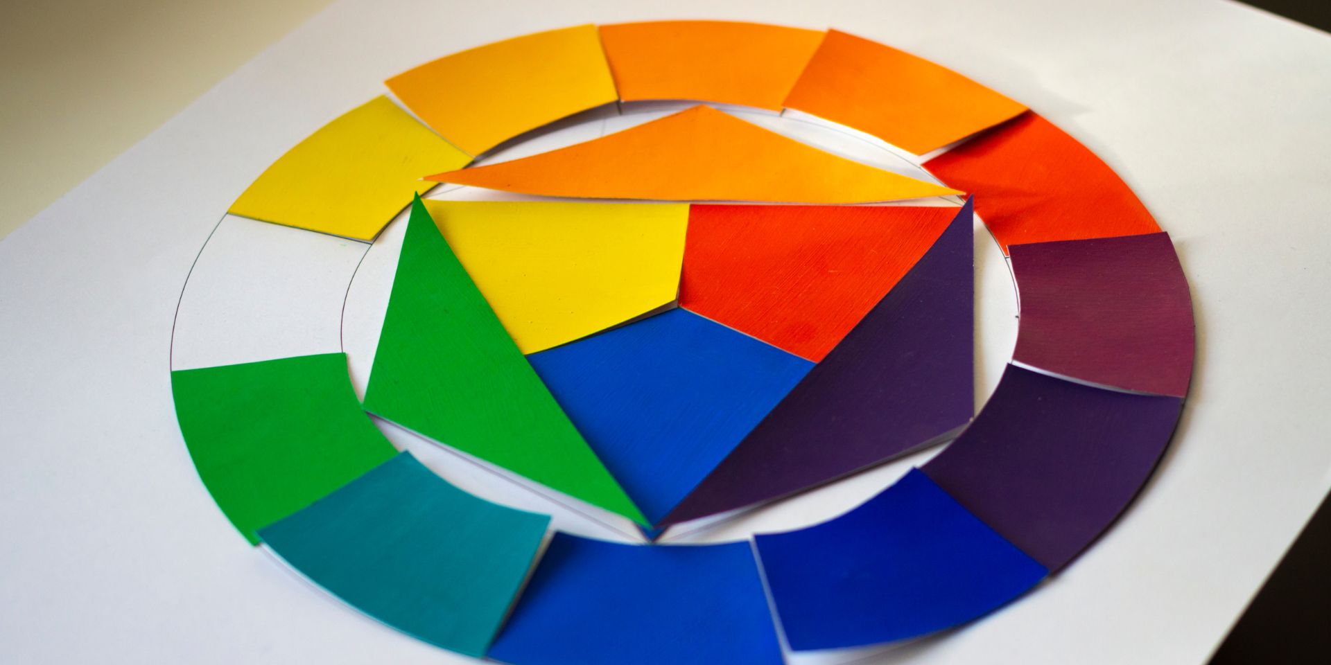
The University of Chicago writes that Newton was the first person to develop colour theory, in the seventeenth century. With the aid of a prism, he noted the spectrum of light and chose to represent what he saw as a ‘colour wheel’. Many modern designers still consult this resource today.
This discovery developed the idea of having blue, red and yellow as the primary colours. The design projects that thefingerprint works on are guided by this historical tool when creating a visual effect or emotional connection through colour.

How does colour theory work?
The chances are that you will have seen the colour wheel reproduced hundreds of times during your life. A circular diagram of the colour spectrum, most of us learnt about playing with colour during the early years of school. Entire lessons can be dedicated to understanding the following three colour groups:
- Primary colours
- Secondary colours
- Tertiary colours.
Whilst we recommend using no more than two or three individual colours in any one design, including for your logo, there are three ‘colour schemes’ that can guide its creation and determine the effect of your branding and marketing projects.
Complementary colours
Blue and orange, red and green, yellow and purple. These dynamic duos face each other on the colour wheel and are opposites in the spectrum of light. Two complementary colours can produce an eye-catching ‘look’ that successfully divides up the page by employing contrast. When you employ complementary colour schemes, different sections of your design can juxtapose with one another whilst holding their own.
Analogous Colours
Analogous colours are located next to each other on the colour wheel. Three adjacent colours can be used to create a hierarchy, including a dominant, supporting and accent colour. This produces a harmonious effect, meaning those viewing a design in this scheme will feel at ease with the selection.
Helping to bring potential clients or customers on board with your message, this second colour scheme can guide the focus and strength of feeling on different sections of your website, such as call-to-action buttons.
Triadic Colours
Rather than randomly choosing a trio of colours on the colour wheel, this scheme selects three regularly spaced options. The effect here is to create balance. Usually, the result is a bright and colourful brand asset that combines contrast and cohesion in one design. Each element of the scheme holds its own whilst working together as a whole.
Now that we know more about colour schemes, it is time to consider another key aspect of colour theory. It is time to examine the meaning of different colours on the wheel.
Cultural meanings
Don’t think colour can influence millions of people to trust your business? You would be hasty to ignore colour theory. Our previous blog Colour – Why Making the Right Choice Matters, showed how branding relies on commonly accepted colour ‘meanings’ to communicate a company’s values and messaging.
Colour psychology (with brand examples) is explored in that article but can be summarised as:
- Red for action
- Orange for positive energy
- Yellow for optimism
- Green for growth
- Blue for reliability
- Purple for luxury.
However, these meanings are not universal and there will be exceptions across different cultures. Therefore, briefing your designer on your company’s target demographic and values is always a wise move.
How can colour theory benefit your website or brand design?
Did you know that “people decide whether or not they like a product in 90 seconds or less [and] 90% of that decision is based solely on colour” (Medium)? Whilst this can sound intimidating, it actually makes colour theory your best friend (and teacher) when designing. Selecting colours and colour schemes that work harmoniously can spark an emotional response from the viewer … aka your prospective lead.
Effective colour combinations can also influence the behaviour of visitors whilst they explore your website.
This includes:
- Leading the viewer through your site
- Directing them to a call to action (e.g. ‘Contact Us’)
- Anchoring them to your brand
- Making key sections or areas standout
- Creating greater brand recognition and awareness.
Can you afford not to employ colour theory in all of your branding or marketing?
Grow with expert-led colour theory
Depend on thefingerprint for design experts who understand colour theory and how it can lead to sales as well as valuable business relationships. Contact us or call 07740 348 521 to get the ball rolling on your brand’s design evolution.
If you are enjoying this article please read our blogs Colour – why calibrating your monitor is important, What to include in a copywriting brief, or thefingerprint wins Design Agency of the Year for a third year!.