Fonts – why they are important to get right
We will provide guidance on why its important to get fonts right.
Fonts – Do they really matter?
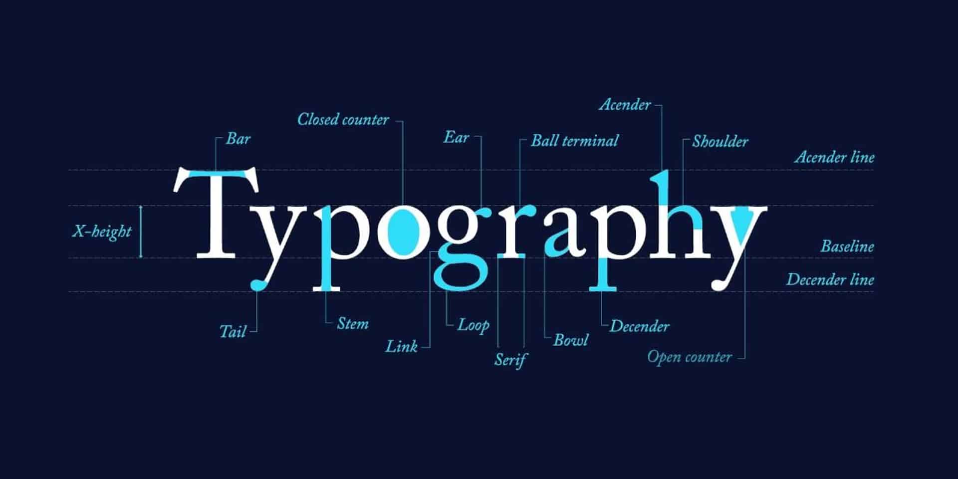
Used in printed materials, digital marketing, general branding and infographics on social media, the type of font you choose to represent your business is key. Not only do first impressions count, but your font choice can influence prospective customers’ perceptions of you. It can suggest:
- Your values
- Your industry credentials
- Your trustworthiness.
Your branding needs to resonate with your target market and influence their behaviour towards that all-important sale. And your chosen font is a major ‘slice’ of the branding pie you can wield to achieve this aim. With this in mind, we’ve created a useful guide on why getting your font right matters.
Does your font matter more than your word choice?
Potential clients and customers will be subject to something psychologists call ‘the Picture Superiority Effect’. Humans are ‘wired’ to notice the look of the writing more than the meaning of the content itself. This means the font you choose for your logo, marketing and anything else that represents your brand, should arguably be given more consideration than the words written down (Envato).
This is especially true when you realise that effective brands use the same few fonts to stand out from the competition and build their profile. Consistency in design is king after all! As you’ll discover, font choice has an emotional effect on those viewing your content that can influence their behaviour and buying choices.
Fonts can suggest a premium product
In 2019, Hyunjin Song and Norbert Schwartz created an experiment involving restaurant menus. Diners were asked to give their impressions of one dish – presented on the menu in different fonts. Half of the group viewed the same written content in plain ‘Arial’ – whilst the others were given a menu in ‘Mistral’, a joined-up script-like font.
The results were eye-opening! The diners who had read the menu in the Mistal font “were more likely to conclude that the dish was hard to prepare and required great skill” (Time). It gave the same dish a higher perceived value. This creative script worked because it suggested a superior level of creativity involved in cooking the meal among the second group.
However, Mistral would not have engendered more trust within literature for industry professionals such as lawyers, estate agents or financial advisors. Here, Mistral could have appeared overly creative, flowery and informal.
These two examples remind us that your brand’s font needs to be industry appropriate and project the ‘right’ connotations.
Font psychology 101
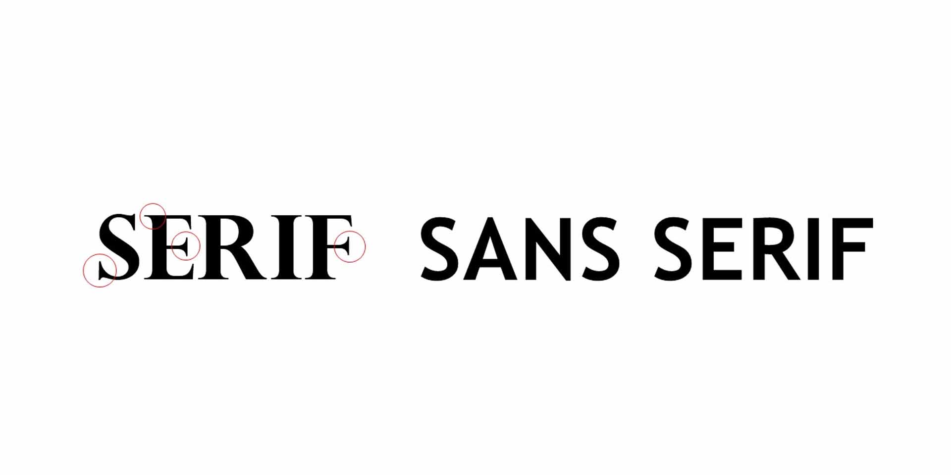
Serif
Traditional and respected, serif fonts are the fonts which feature serifs (extensions) to each individual letter. Wondering what this means in practice? A ‘serif’ is “a decorative line or taper added to the beginning and/or end of a letter’s stem” (Canva).
Businesses who use this type of font can project their longstanding presence and authority. This reassures potential clients that they will provide a dependable service. Usually favoured by corporate industries such as legal, financial and insurance, this choice creates respect for a company using serif fonts.
You’ll usually find serif as the ‘go-to’ font in publishing as well – and with good reason. The reader’s brain can more easily recognise the characters given their distinctive and more defined letter shapes. This makes serif fonts the perfect choice for more lengthy copy.
Sans serif
The French word “sans” translates into “without” in English. So, naturally, sans serif fonts will not have strokes attached to their letters.
Sans serif fonts denote different qualities to the older serif fonts, including a fresh perspective. It can suggest that the brand is more user-friendly and embraces state-of-the-art ways of working. Businesses who use this more modern font family are consciously distancing themselves from traditional industries – as well as the ways of operating associated with older industry ‘players’. Print and digital marketing materials using serif fonts can also appear chic and confident.
More than a design feature, sans serif fonts can be your secret weapon when educating prospective customers and clients. Researchers including Connor Diemand-Yauman, gave 28 readers 90 seconds to learn about the characteristics of three types of aliens. When tested 15 minutes later, those who had read the same information presented in challenging sans serif fonts (12-point Comic Sans and Bodoni) got 86.5% of the questions right. Yet, the 16-point Arial group only answered 72.8% of the questions with the right answers.
It was suggested that smaller sans serif fonts “encourage deeper processing of the to-be-learned material”. It shows the size of your letters also contributes to the font’s effect on the reader.
Script
These are the chameleons of the font world. They lend themselves to a range of different meanings too. Creative and whimsical at times, script fonts can also appear elegant and traditional. It all depends on the exact choice you make, so choose with caution!
More intricate than both serif and sans serif, script fonts can suggest that yours is a premium brand. A brand is at its most powerful when it mirrors its values, business-related and otherwise in its website design, content and printed marketing materials. It forms a ‘brand personality’, along with the effect of copywriting and colour choice.
The handwritten nature of script lettering also communicates a friendliness that customers gravitate towards
Display
There’s a certain creative freedom that comes with using a display font. They can be bold and creative – but are best served sparingly. Consider using display fonts in your logo and titles only – including on flyers, posters and business cards. Adding a serif or sans serif font for the body of the text gives your messaging room to breathe.
Aka ‘decorative fonts’, it is wise to think of display fonts as the ‘icing on top of your branding cake’. Combining them with the other three font families (as the design’s body text) is therefore a wise move. No one wants to feel bombarded with display copy, as this can deter them from reading the copy (words).
Display fonts are bold, stylised and effective when applied sparingly, however. Different examples of display fonts include ‘Abril Fatface’, ‘Bauhaus 93’ and ‘Goudy Stout’. Apply them to dial up the ‘personality’ of your brand. They create an individual ‘look’ and appeal for businesses that sell creative, children’s, gaming and food products and services.
In conclusion
These font-based associations allow your business to reinforce its messaging and influence your target customers. So, you need to project the right image the first time. Learn how our multi award-winning services will help you connect with your intended market by contacting us, where we would be happy to discuss how our award-winning services can help you. Simply call +44 (0)7740 348 521, or contact us for more advice.
If you are enjoying this article please read our blog Designing for Print – Does it Still Make Sense?, Colour – Why Making the Right Choice Matters, Why writing a blog is important for business and SEO or Why a brand is important and why it’s not just a logo, all of which are important to reaching clients and increasing sales/business opportunities.


