Should You Design Your Website for Mobile or Desktop First?
We’ll consider whether it’s best to prioritise web design for mobiles or desktops.
Should You Design Your Website for Mobile or Desktop First?
There’s no denying the rise of mobile shopping, with mobile retail sales totalling nearly £92 billion in 2023. You may well see sense in prioritising engagement of the mobile audience, given the relatively low numbers of people opting to make purchases via their laptops and desktops. But does that mean that you should begin by designing your website for hand-held devices? It depends largely on your target audience and digital intentions, as we highlight in this blog.
The Responsive Choice
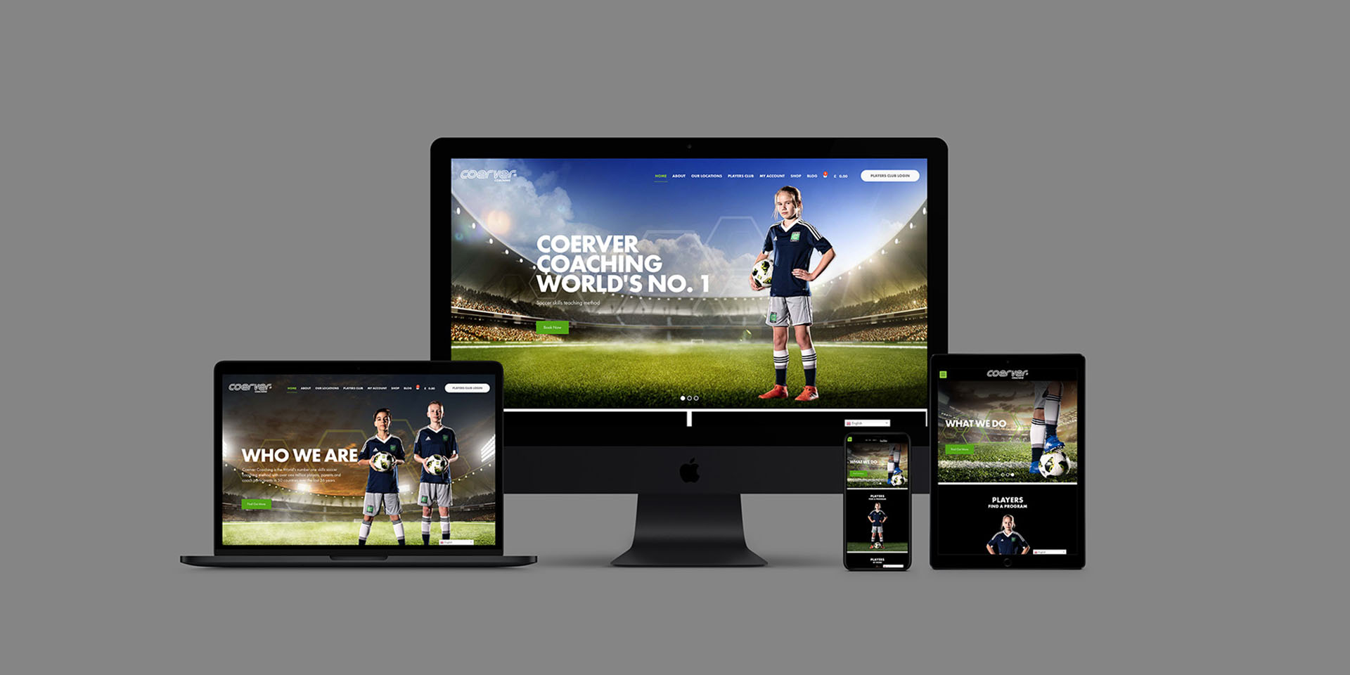
Before exploring the pros and cons of mobile-first and desktop-first design choices, it’s worth pointing out that you can achieve the best of both worlds. In developing a responsive website you can be sure that the digital experience will adapt based on the the user’s behaviour and environment. The layout will be automatically updated when displayed on different devices and screen sizes. However, you’ll still need to decide whether to focus on the mobile or desktop audience in the initial design of your website.
A Mobile-first Approach
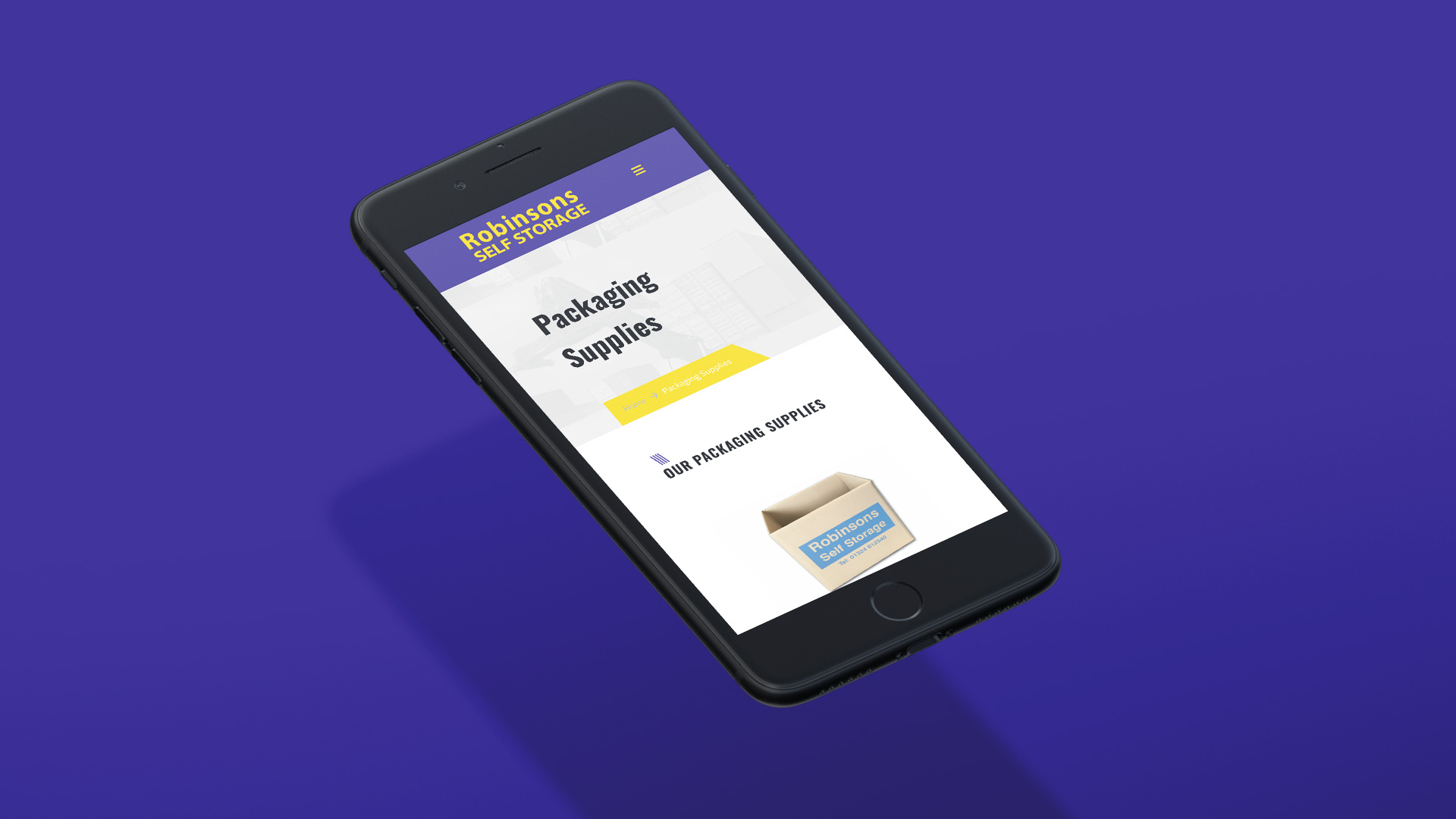
Website speed will be a priority if you’re focusing on the mobile audience. This will mean having a simple and streamlined navigation. As such, you might opt against the inclusion of vibrant photos and videos for rapid page loading times. It’s an approach that could make for higher website rankings, given Google’s focus on site speed.
The building of your mobile-friendly website may allow for a visual and functional evaluation, in readiness for scaling up to the desktop version. You’ll have to be more critical, deciding whether visual elements should be included or compressed given their effect on loading times. If you’re too restrictive in your choices then there will be a risk of your website looking bland and uninspiring when it’s converted for desktop viewing. You could end up losing customers as your website lacks an appealing identity, missing the kinds of visuals likely to inspire online purchases.

Designing for Desktops
There’s some variation across different sectors. However, a look at your analytics may reveal that your website is more visited by desktop than mobile users. This might encourage you to opt for the desktop-first approach. It will allow for more freedom and complexity in the design of your site.
Taking the desktop-first approach, you’ll have more scope for the creation of valuable and authority-building content. The text will be written in your distinctive brand personality. It will effectively highlight the benefits and address the pain points of your target audience. Relatively fast website loading times may be achieved, even if you include high-quality videos and pictures.
Focusing on mobile users
A website built for desktop visitors will also be relatively easy to strip back and optimise for mobile. You can replace high-resolution images with flat versions that will load quickly on mobile devices. Elements can be adjusted in terms of size and layout to reduce the need for scrolling. You might even opt to delete some sections for the most streamlined mobile experience.
Here are some other factors to consider in your choice of mobile-first or desktop-first design:
- Audience – are you targeting a Gen Z audience who’d rather be without their toothbrushes than their mobile phones? Or, are you focusing on the older generation who prefer to shop on their desktops?
- Industry – are you in a complex and highly-regulated industry? Or, do you have a simple online shop that could be featured effectively on mobile devices?
- Goals – are you focused on sharing information, building your thought-leadership reputation, or simply achieving as many online sales as possible?

Choose thefingerprint
It’s up to you whether to optimise your site for mobile or desktop. In either case, you’re encouraged to call on thefingerprint for expert design. As showcased on our portfolio page, we have the proven ability to create websites that look great and perform equally well on the full range of devices.
So go ahead and give us a call on +44 (0)7740 348 521 or email design@thefingerprint.co.uk for a chat about the development of your website.
If you found this helpful then you should also have a read of Designing for Print – Does it still Make Sense, Why You Should Invest in Professional Copywriting Services, or thefingerprint wins Design Agency of the Year for a third year!


